Hi all, it's that time of year again where we're approaching the anniversary of the forum. Can you believe we'll be 2 years old in January? We've been FastDay for close to a year now as well! Where does the time go?
For me this last year has not been the best, but I'm not here to bore you with my health issues! So as I wish good riddance to 2014 I say hello to a fresh new year full of new and exciting things for FastDay. Not only will we be launching our online courses for new 5:2ers (currently doing well in our trials) but we've got some fab updates in store for existing members too!
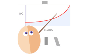
An updated Progress Tracker
You may or may not remember, but around this time last year I started work on a load of Progress Tracker enhancements and fixes, based on almost a year of feedback & bug reports This ended up being put to one side due to my ill health and I thought it was time to pick it up again at last...
...but we've decided to do better than that! We've got such a great tech team together at FastDay that it seems silly for me to bodge something together with my shoddy coding ability, lol. Our team has started work on a fantastic new tracker - and let me tell you, I'm most impressed by what I've seen so far! We've had some feedback from our Brainstormers groups (thanks to all involved!) and have been discussing various aspects of it for some time now to make sure we get it just right.
For many of you this news will be met with a sigh of relief as you've been avoiding using the tracker during maintenance - it was never really built to deal with that phase of the fasting journey properly. When I first built it I did so for such a small group of us, I had no idea the community would become as large as it has and my poor old code has been choking on the sheer volume of data it now has to handle. Other among you will simply be glad to know that there are going to be more options for tracking and better handling of imperial/metric measurements.
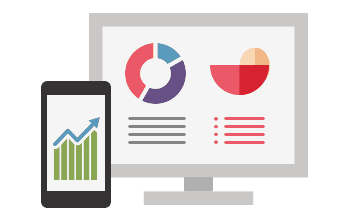
I also recognise that for some of you the idea of a new tracker is actually quite daunting! Please let me assure you that it is really going to be so simple to use. The team has been hard at work planning how best to organise things to make it not only more easy for the community to use, but also for the team to be able to add features. So, the ability to track more measurements such as hips, neck or even more medical things like blood pressure, blood sugar etc may not be far off. You'll be able to use as many or as few of these mini trackers as you like, so your screen won't be cluttered with information & inputs which aren't of interest to you. Yay!
Speaking of cluttered screens, the existing tracker was never designed with mobile screens in mind... yup, you guessed it - the new one has been built with this in mind from the onset. It will scale beautifully to fit all manner of screen sizes, while keeping viewing & entering of data simple and clear.
I can't give you a set date as to when the new tracker will be available, but the team is beavering away and making progress much quicker than expected. Rest assured that it will be sometime in the early part of next year and that you'll be able to port your existing tracker data over to it so nothing will be lost.
If any of you have any particular concerns about this, please do let me know either in a reply here or by messaging me and I'll be happy to raise these issues with the team and come back to you with a response. We want you all to love the new tracker after all!
Goodbye Yellow! It's time for a face lift!
When we launched the FastDay site our focus was on getting the content together & organised. We tried to ensure the site was user friendly and stuck to the brand colours selected by the team... unfortunately we found the yellow didn't go down well with the community and it's been a bit of a 'marmite', love it or hate it. Some of you find it so bright and cheery, others have to browse the site with a blindfold!
We'd really love to give the site a bit of an overhaul with a new colour scheme. I know the old look was pretty popular and while we won't be reverting to it as such we may go back to similar colours. I did like the muted blue, green and red
Last time we made the mistake of making these decisions without the community being involved in them. I'm sorry about that, this year has been anything but normal for me and I'm grateful to the team for getting things done while I was not really able to be involved. This time we all feel it's best to consult with the community for some feedback.
It's important we get some balanced views about our new design ideas so we'd love to take on a group of you as volunteers for us to bounce ideas off. We need some of you who hate the yellow and some who don't. We want to find a look which pleases the majority instead of splitting opinions down the middle. We'd also love to have some feedback from folks who are concerned about the changes as we want to be sure that everything is still usable and is basically just more lovely to look at. We don't want new fasters coming here and half of them being put off by the colour scheme or characters, and while I know we can't please everyone I'm sure we can do better than this with the great team we have together now.
FastDay wants YOU!
We want to know what you think about the above ideas. Don't just butter us up, it's every bit as important for us to know what you don't like, what you're worried about and also any ideas you might have which you think everyone would find useful.
I for one can't wait to welcome lots of new fasters on board in 2015 and making it easier not just for them but for all of us to track our progress! I really must tip my hat to the FD team for all their hard work - much of it goes unseen by the community, behind the scenes tinkering while also planning and developing future features. Next year is going to be an exciting one! Roll on 2015!
For me this last year has not been the best, but I'm not here to bore you with my health issues! So as I wish good riddance to 2014 I say hello to a fresh new year full of new and exciting things for FastDay. Not only will we be launching our online courses for new 5:2ers (currently doing well in our trials) but we've got some fab updates in store for existing members too!
An updated Progress Tracker
You may or may not remember, but around this time last year I started work on a load of Progress Tracker enhancements and fixes, based on almost a year of feedback & bug reports
This ended up being put to one side due to my ill health and I thought it was time to pick it up again at last......but we've decided to do better than that! We've got such a great tech team together at FastDay that it seems silly for me to bodge something together with my shoddy coding ability, lol. Our team has started work on a fantastic new tracker - and let me tell you, I'm most impressed by what I've seen so far! We've had some feedback from our Brainstormers groups (thanks to all involved!) and have been discussing various aspects of it for some time now to make sure we get it just right.
For many of you this news will be met with a sigh of relief as you've been avoiding using the tracker during maintenance - it was never really built to deal with that phase of the fasting journey properly. When I first built it I did so for such a small group of us, I had no idea the community would become as large as it has and my poor old code has been choking on the sheer volume of data it now has to handle. Other among you will simply be glad to know that there are going to be more options for tracking and better handling of imperial/metric measurements.
I also recognise that for some of you the idea of a new tracker is actually quite daunting! Please let me assure you that it is really going to be so simple to use. The team has been hard at work planning how best to organise things to make it not only more easy for the community to use, but also for the team to be able to add features. So, the ability to track more measurements such as hips, neck or even more medical things like blood pressure, blood sugar etc may not be far off. You'll be able to use as many or as few of these mini trackers as you like, so your screen won't be cluttered with information & inputs which aren't of interest to you. Yay!
Speaking of cluttered screens, the existing tracker was never designed with mobile screens in mind... yup, you guessed it - the new one has been built with this in mind from the onset. It will scale beautifully to fit all manner of screen sizes, while keeping viewing & entering of data simple and clear.
I can't give you a set date as to when the new tracker will be available, but the team is beavering away and making progress much quicker than expected. Rest assured that it will be sometime in the early part of next year and that you'll be able to port your existing tracker data over to it so nothing will be lost.
If any of you have any particular concerns about this, please do let me know either in a reply here or by messaging me and I'll be happy to raise these issues with the team and come back to you with a response. We want you all to love the new tracker after all!
Goodbye Yellow! It's time for a face lift!
When we launched the FastDay site our focus was on getting the content together & organised. We tried to ensure the site was user friendly and stuck to the brand colours selected by the team... unfortunately we found the yellow didn't go down well with the community and it's been a bit of a 'marmite', love it or hate it. Some of you find it so bright and cheery, others have to browse the site with a blindfold!
We'd really love to give the site a bit of an overhaul with a new colour scheme. I know the old look was pretty popular and while we won't be reverting to it as such we may go back to similar colours. I did like the muted blue, green and red
Last time we made the mistake of making these decisions without the community being involved in them. I'm sorry about that, this year has been anything but normal for me and I'm grateful to the team for getting things done while I was not really able to be involved. This time we all feel it's best to consult with the community for some feedback.
It's important we get some balanced views about our new design ideas so we'd love to take on a group of you as volunteers for us to bounce ideas off. We need some of you who hate the yellow and some who don't. We want to find a look which pleases the majority instead of splitting opinions down the middle. We'd also love to have some feedback from folks who are concerned about the changes as we want to be sure that everything is still usable and is basically just more lovely to look at. We don't want new fasters coming here and half of them being put off by the colour scheme or characters, and while I know we can't please everyone I'm sure we can do better than this with the great team we have together now.
FastDay wants YOU!
We want to know what you think about the above ideas. Don't just butter us up, it's every bit as important for us to know what you don't like, what you're worried about and also any ideas you might have which you think everyone would find useful.
I for one can't wait to welcome lots of new fasters on board in 2015 and making it easier not just for them but for all of us to track our progress! I really must tip my hat to the FD team for all their hard work - much of it goes unseen by the community, behind the scenes tinkering while also planning and developing future features. Next year is going to be an exciting one! Roll on 2015!